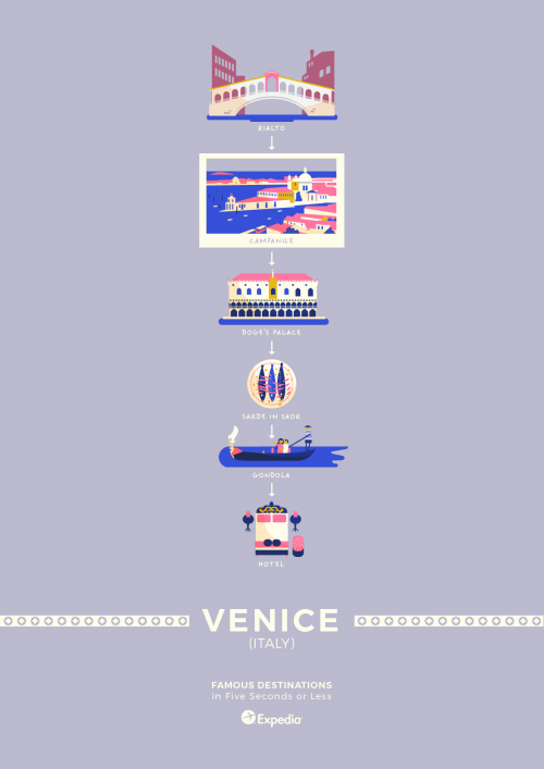
Travel brochures can be a bit much to handle when you just want to get away from it all and have a simple, fun adventure! In the clamor to make you feel like you are getting value for money, promoters stuff everything into their promotional materials: noisy photo montages, maps within maps, and snippet guides to the hundreds of attractions you might want to check out. It is the opposite of relaxing.
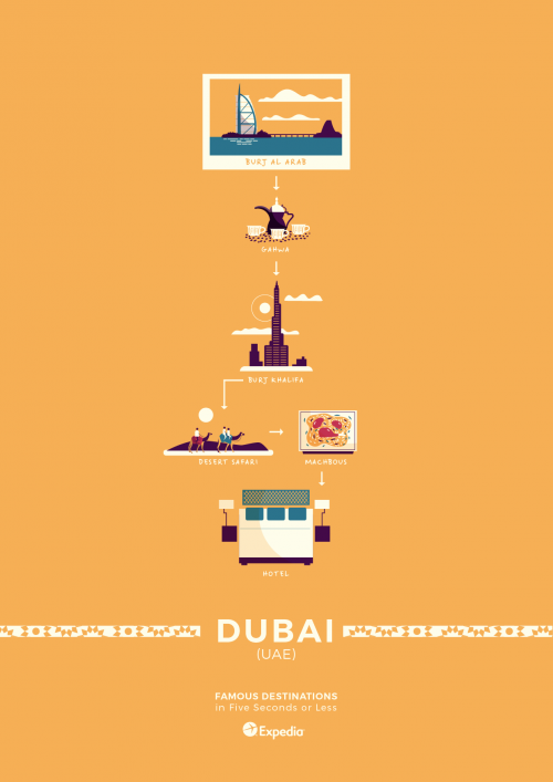
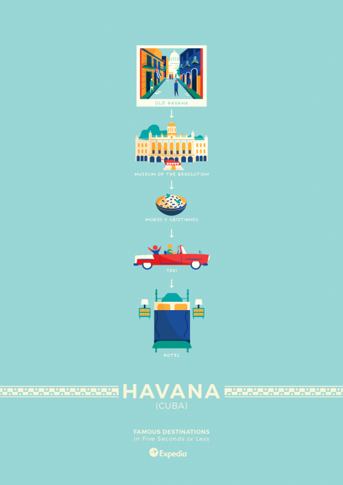
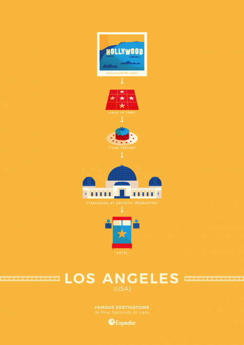
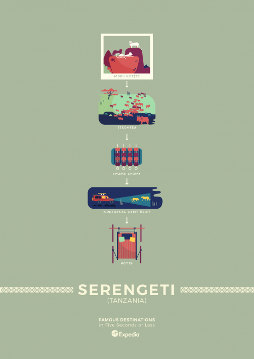
The people at Expedia have come up with an antidote: the minimalist travel poster. Using refined design principles and inside knowledge into how to truly get the best of places from Berlin to Venice, their posters are both easy on the eye and informative.
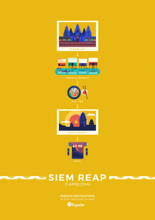
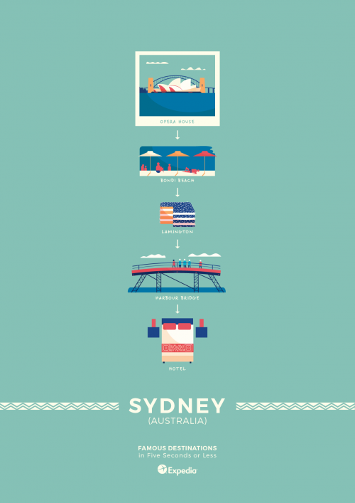
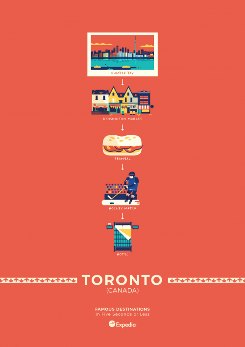
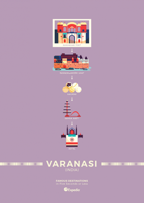
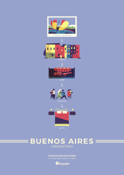
Each one features a series of miniature illustrations that guide you through the must-sees of the given city in just a five-second glance. They even feature a recommendation on what local cuisine to try — handy to help you make a decision when you have one day in town and everything smells great.
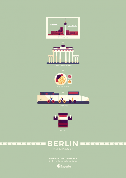
Berlin, for example, begins with a trip to the Panoramapunkt viewing platformat at Potsdamer Platz, from where you can instantly orientate yourself by gazing out across the city.
You will then take in the historic Brandenberg Gate and stretch your legs with a bike ride around the route of the former wall, now known as the Mauerweg. Currywurst, spiced sausages, will fuel your adventure and can be eaten as street food along the way. Yes, the sausages also feature in the poster! It can all be done in a day without the feeling that you have missed something.
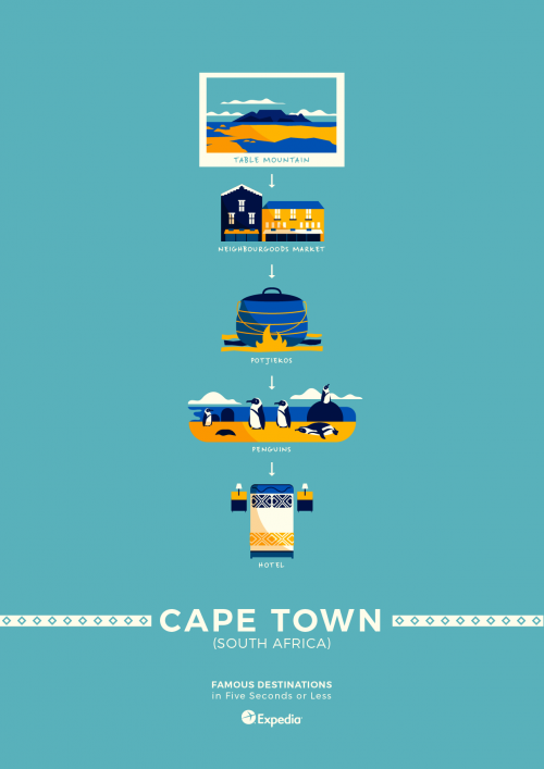
Next stop: South Africa. Cape Town is represented by just five exquisite diagrams. You will start at Bloubergstrand, from where you can snap an iconic photo of Table Mountain beyond the bay. You will dine on potjiekos after wandering Woodstock’s Neighbourgoods Market and the honking and hooting penguins of Boulders Beach.
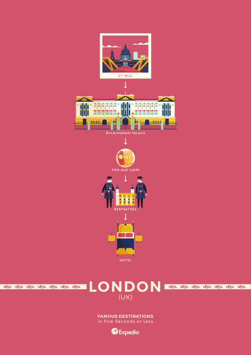
It will be fish and chips in London, of course, though not before you have visited the imposing presence of St Paul’s Cathedral and taken the obligatory selfie waving to the Queen from outside Buckingham Palace. The illustrations for minimalist London look like something from a Wes Anderson movie, and you will want to dress stylishly to fit in among London’s cosmopolitan locals.
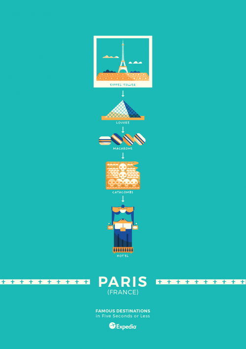
But perhaps Paris’s poster design is the most stylish of all. The French capital exudes geometry-chic as the familiar shape of the Eiffel Tower and the glass pyramid of the Louvre are isolated from their surroundings and relocated to the calming space of the minimalist poster.
Even the catacombs take on a ghoulish pattern with the artist’s rendition of row after row of skulls. They are not the city’s most famous feature, but that makes the catacombs all the more worth a visit. The tunnels were originally dug, over 700 years ago, to facilitate stone mining, but later became a burial ground for six million Parisians, and today the labyrinthine walls of bone make for a chilling but inspiring wander.
Deciding what to do is no problem with these simple, beautiful travel posters — the only tricky part is deciding which of the fourteen destinations you want to visit first!
