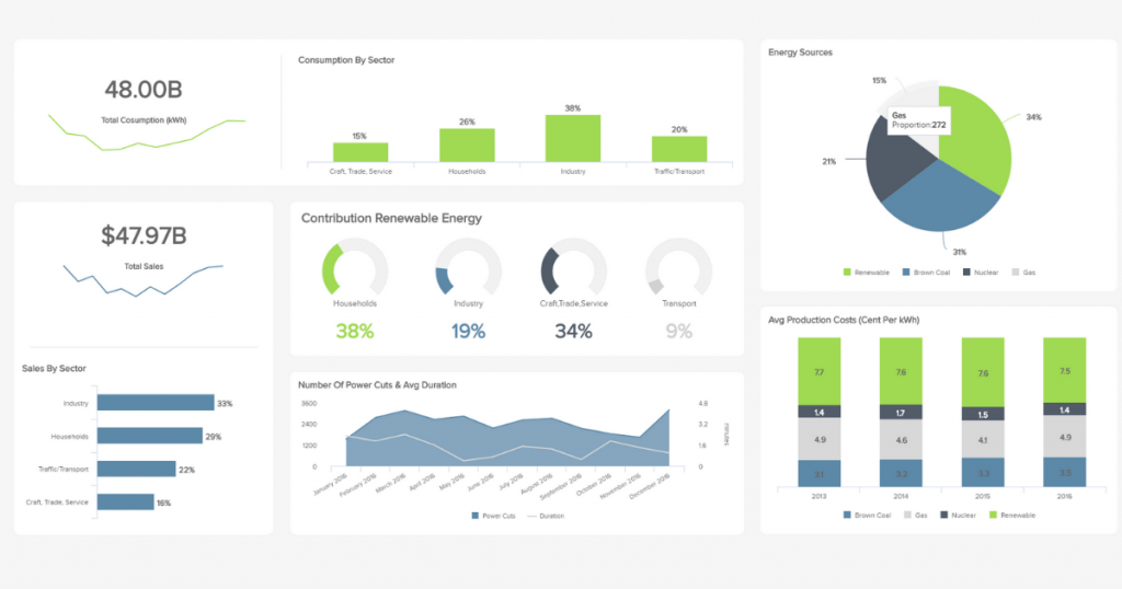
Some ideas were tough to imagine and devise, such as the microwave oven, gyroscope and transistors. Then, there are ideas so simple that it is weird how we hadn’t thought of them in the past, like restaurant menus in braille, USB connectors that go in any direction, and using LED lights for more than Christmas Tree decorations. Then we come to the life of a network operation manager and the use of analytics dashboards. Mere weeks after the installation of analytics dashboards, network operations managers start wondering how they ever lived without them.
If Analytics Dashboards Are So Great: Where Have They Been Until Now?
Like a lot of new and innovative technology, larger companies often have the resources required to experiment with and install them. Small and medium businesses are a little more cautious. The installation of new software or hardware is worrying enough, but when it fundamentally alters the way a key staff member/team works, then even more caution is often applied. In some cases, the network operations manager needs some hardcore reeducating in order to move away from the older operations process and embrace the simpler and more efficient analytics dashboard method.
You can also understand why important figures in many key positions have been slow on the uptake when it comes to analytics dashboards. Let us not forget that just ten and twenty years ago, the sheer level of information available, and the tools to manipulate it, were only present in some of the largest companies. Do not forget that something as fundamental as Cloud computing only became a mainstream tool in the post 2006 era when a Google CEO popularized the term and services started becoming more widely available.
The data processing power and analytic tools we use today were not present in small-to-medium businesses as few as twenty and ten years ago, and yet the network operations managers who were hired ten years ago to do their job are still in their positions today. Ergo, it is easy to see why the adoption of network monitoring, modern big data, Cloud processing, or dashboard tools have been slightly slower to catch on within smaller-to-middle sized businesses.
Reasons Network Operations Managers Use Analytics Dashboards: The Quick Answer
If you are thinking about using analytics dashboards, perhaps you are curious about the subject of analytic dashboards, then this article is stuffed with information you are going to need. However, if this is the fourth or fifth article you have read on this subject, here is a selection of some of the reasons why network operations managers should use analytics dashboards.
- It makes an operations manager’s working process more efficient
- More information may be understood and processed more quickly and easily
- Other staff members can be brought up to speed more quickly
- Analytics dashboards increases understanding and make reporting easier
Plus, your analytics dashboard keeps things simple on the surface, but allows for users to access and understand more complex data if they so choose. In other words, it keeps things simple and easy to start with, so that surface level tasks and important broader processes can be addressed first. However, the tool still allows you to drill down to the more complex and long-term tasks because simplifying does not mean dumbing down.
What Should Be Included In A Dashboard?
This article cannot tell you exactly what should be included in your dashboard since every company and situation is different, but you should focus on your user interfaces, monitoring, troubleshooting, backup, network quality analysis, traffic analysis, configuration and software automation, network services monitoring, network compliance management, and orchestration.
Again it is difficult to offer advice on exactly what your dashboard should include because every business is different. So, here is an example featuring an analytics dashboard for an Kitcast digital signage software user.
Auditing And Inventory Reporting – offering a baseline software and hardware inventory, file access protection, network access protection, and application blocker.
Remote Control Monitoring – video streaming success rates, desktop control/access logs, file transfer logs, and maybe even monitoring when manual control has replaced remote control of the digital signs.
Secure Web-Based Interface – managing your network remotely via a secure web portal while offering access from any internet-enabled computer, while also monitoring, allowing and blocking said services.
Alerts – all remote intervention could be prompted by analytic monitoring (automated or otherwise), and monitoring changes in software and hardware, which includes when digital signs start and stop (turn on or off).
Messaging – part of your dashboard settings could involve customizable messages (email or SMS) that alert operations managers of errors or pressing issues.
Scripts – in this case would be handled by KitCast.tv software, but where the analytic dashboard shows schedulable script execution on each digital sign, screen and device control, and things like retrieving log files and such.
Patch Management Reporting And Troubleshooting – configuring and scheduling of deployments based on previous analytic data, pre-installation progress, and automatic software updates (such reports are also handy for troubleshooting).
Problem Ticketing – if many digital signs are placed in several different geographic locations, ticketing and issue progress could be monitored with an analytics dashboard.
Customizable Reports – a reports tool would offer information on everything, such as patches, hardware or software inventory, ticketing, logs, monitoring, up-times, etc.
In many cases, the analytics would also play a big role in the operations process itself. For example, your analytics may show how many problem tickets you have, and the same tool may also present the tools required to take action on the tickets (such as contact client, deactivate sign, etc.).
What Is The Main Purpose Of Dashboard?
The main purpose in simple terms is to make the operations manager’s job easier. Its job is to track information and visually display it for the user. Analysis also plays a role, and the results of such analysis are also displayed, often in the form of visual graphics rather than raw data.
A network operations manager may be expected to customize the analytics dashboard to show relevant key performance indicators (KPI). In other words, the user may start out with a template, but will eventually have to change the way the analytics dashboard looks and works in order to better suit the job in hand.
What Makes A Good KPI Dashboard?
Easy access to information, easier data comprehension, and having the correct information presented in a way that allows people to drill down and mine more information if needed. Also, design plays at least a small role in making the user a little more comfortable; this includes how the information is arranged and how it is displayed.
Arranged – How the information is arranged and designed is important. The most important metrics and KPIs should be the most prominent and/or have the least number of steps to access. Data should be logically organized, putting the most commonly used filters as defaults. Information should start out displayed simply, while allowing the user to drill down to the more complicated information.
Displayed – Use active and passive white space correctly, create focal points, and consider grouping items together based on who uses the information, through logical use of categories. Maintain design continuity, making sure to fold new tools, items or information into the system in a logical manner (i.e. not simply creating a new category whenever something new comes along). Keep things correctly spaced for ease of use and reading, and do not put similar shaped and similar colored items together where they may suffer mistaken identity by new users.
Reasons Network Operations Managers Use Dashboards
The short answer is because it allows them to do their jobs, allowing them to ensure service quality and network efficiency. Data analytics dashboards are now a staple of modern business intelligence to the point where modern operations managers expect them, just like modern writers expect a computer and not a typewriter.
Also, where decision making is concerned, correctly reported analytics may help a professional manage the budget, as well as lead improvements to maintenance, service restoration, provisioning, and data center processes and capabilities (to name just a few things). The dashboard also plays a part in reporting on your own efforts, be it proving you are doing your job, to developing the documentation that accurately reflects the day-to-day running of your team. In a broader sense, your analytics tool may also help you:
- Improve visibility into both the virtual and physical infrastructure of the organization
- Reduce downtime, eradicate downtime, or optimize downtime so it has the lowest impact
- Identify network issues more easily, and avoid or reduce the impact of recurring issues
- Provide faster resolutions for staff, the company, or customer’s with escalated issues
- Pre-built reports also make integration quicker, training quicker, and are handy fallbacks
- Make the job more visual, especially when wanting to restore services faster
- Use it and your own knowledge to improve AI systems, such as AI diagnostic systems
- More easily sort, arrange, and look up your historical data
- Make sharing information easier and make collaboration easier
- Create more accurate predictive models and plan accordingly
With all this said, the simple fact is that if you use your analytics dashboard correctly, then it makes your job as a network operations manager easier. You can dig a road with a pickaxe, or with a pneumatic drill, both get the job done, but one method is easier. As a network operations manager, you can work hard and get your job done, or you can use your analytics dashboard make your life easier. The choice is yours.
